Is bringing back pixel art just lazy design, or are we tapping into something deeper?
We have the most advanced design tools in history, screens that can render photorealistic graphics, and AI that can generate entire interfaces in seconds.
Yet designers are deliberately choosing chunky pixels, skeuomorphic leather textures, and interfaces that look like they were built on a 1995 Macintosh.
Pixel art is predicted to remain popular at least until 2025 and beyond, and skeuomorphism is re-emerging in a reinterpreted form thanks to technological advancements and a growing sense of nostalgia among users.
The question is why it's working so well, and how you can use it without making your product feel dated. Let's dive in.
TRENDING JOBS
Share with your network!
1) Product Designer, Microsoft.
Washington, 2-5 years.
Apply
2) UX Researcher, Microsoft.
United States, 2-5 years.
Apply
3) Graphic Designer, MedPro Systems.
New Jersey, 3+ years.
Apply
Find more marketing jobs on the TDP Job Board.
TDP SPOTLIGHT

At TDP, we just wrapped up redesigning David Energy's platform to transform how facility managers interact with their energy consumption data.
Who it's for:
Small commercial facility managers struggling to understand complex energy usage patterns and identify cost-saving opportunities before they become expensive problems.
What we did:
Established David Energy as a trusted energy advisor by creating an intuitive platform that surfaces critical insights, optimizes energy management workflows, and enhances the entire customer journey from onboarding to ongoing communications.
The result:
A comprehensive solution that gives managers complete visibility into their energy operations, proactively flags billing issues, and positions David Energy as a fundamentally different kind of energy provider - more efficient and reliable than traditional utility companies.
Why Nostalgia Hits Different in 2025
Recently, more and more designers are creatively blending 80s and 90s aesthetics like VHS static, neon grids, and pixel art with modern frameworks for a playful, nostalgic yet forward-looking feel.
This comeback is a direct response to "design fatigue" - the sameness that happens when every app looks like it was designed by the same committee. When Stripe, Spotify, and your banking app all blur together, suddenly a website that looks like Windows 95 feels refreshing.
But here's the deeper psychology: With screen fatigue hitting harder than ever, there's growing dissatisfaction with ubiquitous touchscreen interfaces, fueling demand for more tactile, intentional interactions.
We're craving the tangibility of physical controls, the texture of real materials, the warmth of imperfection.
As the world around us becomes more chaotic, more brands and artists are leaning into the wholesome, friendly, and welcoming vibes of pixel art and chunky universes.
After all, when everything feels uncertain, we retreat to the familiar.
3 Pillars of Nostalgic Design
1. Pixel Art: The Anti-AI Aesthetic
With the rise of hyper-realistic graphics in video games and AI art, more artists are turning to pixel art because it showcases a human element often missing from photorealistic art. Each pixel is a deliberate choice. You can see the craft.
Modern games like Stardew Valley and Minecraft have introduced pixel aesthetics to Gen Z - people who never experienced the limitations that created this style. The app Stardew Valley offers a popular mobile experience centered on farming and community-building, with its gentle pace, nostalgic pixel art, and focus on personal choice providing players with a soothing escape from daily stress.
2. Skeuomorphism 2.0: Real-World Metaphors Make a Comeback
Skeuomorphism is sneaking back into the limelight, mimicking real-world textures and objects to make digital designs more intuitive and familiar. But this isn't your 2012 leather-bound calendar app. The new skeuomorphism is subtle, sophisticated, and strategic.
Modern screens offer ultra-high resolutions capable of rendering realistic textures with unprecedented detail, and advanced graphics processors allow for smooth animations, adding a tactile and immersive dimension to interfaces. We can finally do skeuomorphism well.
3. 90s Web Aesthetics: Maximum Expression, Minimum Rules
The early web was wild. Designers weren't constrained by design systems or brand guidelines. Designers are creatively blending aesthetics with modern frameworks for a playful, nostalgic yet forward-looking feel. The result? Websites that feel alive, personal, and human.
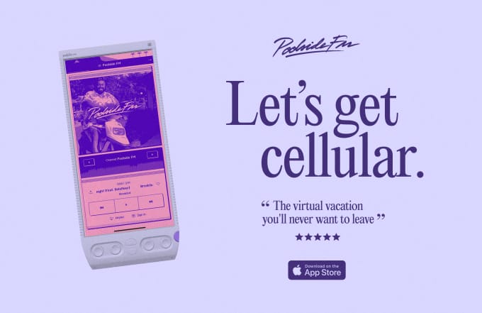
Poolside FM - Building a Virtual Vacation
Poolside FM is a digital time machine created by Dutch interactive designer Niek Dekker, Marty Bell, Aziz Firat, and Lewis King that throws you right back to the 90s, recreating a vintage Mac OS inspired desktop experience complete with a perfect summer soundtrack and lo-fi videos to match.
The site relaunched with a look that emulates a retro computer desktop complete with clickable icons and a menu bar across the top, with music and video player appearing as moveable windows to complete the desktop experience.
The site had about a million listeners in 2022 and currently 65.8K followers on Instagram, with users treating it as an "injection of serotonin straight to the brain." The team literally built a product whose only goal is to make people feel good - and it's working.
The Science of Soothing Design
Gaming spaces are shifting toward cozy, low-stress experiences, catering to players who seek relaxation over competition, mirroring a broader societal push for mental well-being and slower-paced digital interactions.
In fact, design across all products is embracing what some call "dopamine design" or "cozy UI" - interfaces that prioritize comfort over efficiency, familiarity over innovation.
Pixel and low-poly styles offer an emotional, efficient, and artistic alternative to the high-cost, high-fidelity realism many gamers are now burned out on.
The same principle applies to apps, websites, and digital products. Sometimes, the best design choice is to make users feel something - even if that something is a warm memory of using their first computer.
When Nostalgia Works (And When it Doesn’t)
Not every product should look like it was designed in 1995. Here's how to know when nostalgic design makes sense:
Use nostalgic design when:
Your product is about relaxation, creativity, or leisure
You're targeting millennials or Gen Z who have nostalgia for pre-smartphone simplicity
You want to stand out in an oversaturated market
The tactile, human feel supports your brand message
You can commit fully to the aesthetic without half-measures
Avoid nostalgic design when:
You're building enterprise software (unless you have a very specific reason)
Your audience skews older and might see it as unprofessional
The aesthetic gets in the way of core functionality
You're just following a trend without strategic purpose
Accessibility becomes harder to achieve
Key Takeaways
1. Start with function, add nostalgia as flavor
Don't sacrifice usability for aesthetics. This new iteration of skeuomorphism offers a balance between nostalgia and innovation. Your interface should work brilliantly before it looks nostalgic. Then layer in the visual style.
Implementation: Audit your current design. Remove any nostalgic elements temporarily. Does it still work perfectly? Good. Now add them back strategically where they enhance - not hinder - the experience.
2. Mix eras intentionally
The best nostalgic design isn't pure throwback - it's a thoughtful blend. This style uses vintage aesthetics like metallics, chrome, and transparent plastic, wrapped up in clean, modern layouts, merging vintage and modern in a way that's fun while still being clean and usable.
Implementation: Choose one or two nostalgic elements as your signature (maybe pixel art icons + modern typography, or skeuomorphic textures + flat color palettes). Don't try to recreate 1995 exactly - sample from it.
3. Make it performant
Retro aesthetics shouldn't mean retro load times. Pixel and low-poly styles allow developers to focus on emotion, gameplay, and clarity without the need for 4K textures or motion-capture rigs.
Implementation: Optimize your assets aggressively. Pixel art and simplified graphics should load instantly. If your "retro" site is slower than a modern one, you've failed. Use modern web performance techniques - lazy loading, code splitting, efficient formats - behind the vintage facade.
4. Don't sacrifice accessibility
This is non-negotiable. Accessibility is shifting from an afterthought to a design-first priority, with designers now embedding contrast testing, alt text structures, ARIA labeling, and screen reader compatibility from the wireframing stage.
Implementation: Test your nostalgic design with actual accessibility tools. That low-contrast blue-on-gray Windows 95 aesthetic? It needs to meet WCAG standards. Provide high-contrast modes if needed. Make sure all interactions work with keyboard and screen readers.
5. Give users a reason to stay
Nostalgia gets people in the door. Substance keeps them there. The Poolside FM team notes they've "put into a website that won't make any money whatsoever, but if it makes people feel good, that's a huge success" - but even they built real functionality: playlists, customizable themes, community features.
Implementation: Build a nostalgic hook (maybe a loading screen with retro animations), then deliver real value. Don't let the entire experience be a gimmick. Use nostalgia as the entry point to genuine utility.
People are exhausted by optimization. We're tired of algorithms, A/B tests, and interfaces designed to extract maximum engagement. We want to feel something.
Design is, above all, about human connection. Whether it's pixel art, skeuomorphism, or Windows 95 nostalgia, these aren't just aesthetic choices - they're emotional ones.
So maybe the question isn't "Should I use nostalgic design?" but rather "What emotion am I trying to create?"
If that emotion is comfort, familiarity, warmth, or playfulness - if you want to give your users a moment of respite from the chaos - then maybe those chunky pixels and faux-3D buttons aren't such a bad idea after all.
Keep designing,


